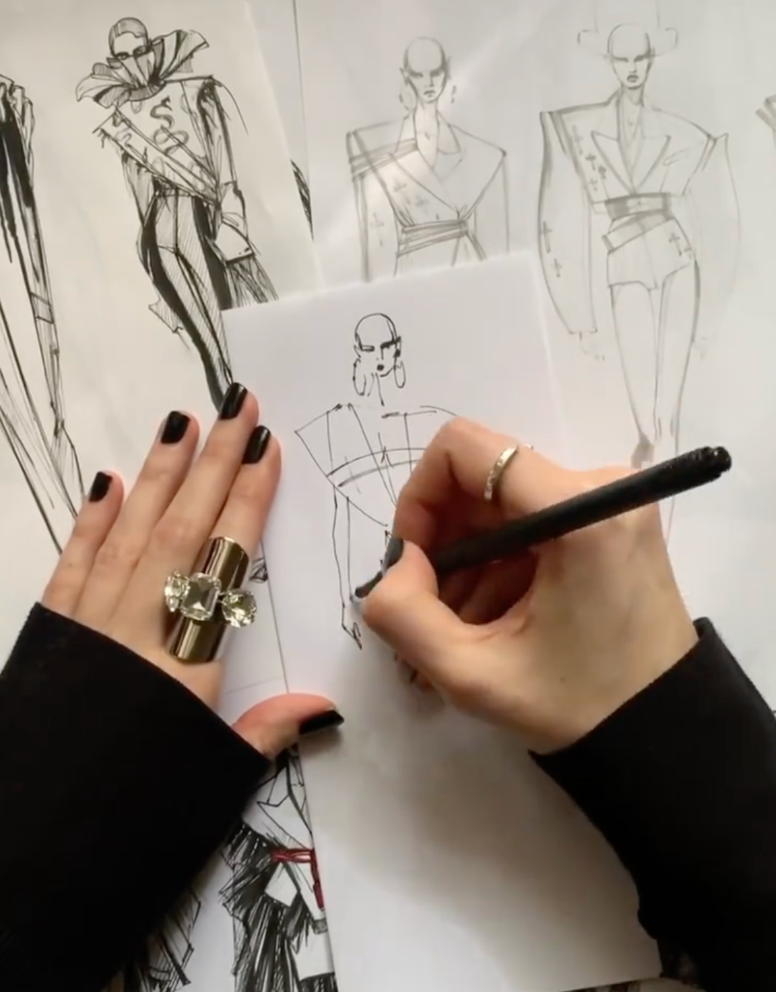
Fashion designer and illustrator Melique Street crafts bold, enigmatic designs, blending super-sharp lines with architectural geometry to create a distinct sense of mystique.
What first drew you to the world of fashion design and illustration? Was there a defining moment when you knew this was your passion?
I have been drawing fashion since early childhood because I always wanted to become a designer. In a professional sense, perhaps one of the first important illustrations was for the Dolce&Gabbana website, because from that moment I started receiving orders, and for a while everything revolved around fashion illustration.

How would you describe your design aesthetic? What are the key elements that define your style in both fashion and illustration?My style of design is futuristic and glamorous. My illustrations are transgressive and punk. I like to draw in a tough manner, I feel my strength when I make sharp, quick lines, and sometimes I literally tear the paper with a pencil while drawing. When I photograph my garments, the main thing for me is to make a mysterious and mystical picture.
Are there any fashion designers or illustrators who have particularly inspired your work? How have they shaped your creative vision?
There are several geniuses of illustration for me: David Downton and Jordi Labanda. These were very strong impressions when I discovered their elegant illustrations in fashion magazines or on the labels of bottles of mineral water. I cut everything out and collected it in a book. Of the older masters, there is Tony Viramontes, who influenced my style in design too, and Antonio Lopez. But the secret of my personal style is that I studied not only fashion illustrations, but also academic artists who have nothing to do with the fashion world. Designers without whom I would be completely different are Rick Owens, Galliano, McQueen, Mugler, Juun J, and Raf Simons.

Italy has such a rich history in fashion. How does Italian art, architecture, or other cultural elements inspire your collections?
Architectural geometric shapes are always inspiring. For example, you can endlessly look at the Centrale in Milan, the most beautiful train station in the world! It has a lot of elements that can be taken and reworked into clothing design. I love old palazzi and villas, they look like very unusual objects of modern art. A mix of modern and ancient always works great. Interior designers such as the Memphis Group are very inspiring too; it's about shapes and colours.

What are your go-to tools or software for creating your illustrations - digital, traditional, or a mix of both? Why?
I come from a family of artists, and since childhood, it has been very important for me to do everything with my hands; it's in my blood, so I will always draw only with my hands. However, since age 15, I started using Photoshop to retouch pictures because it was essentially the only way to escape reality and create photos with my dresses, to get closer to my dream of creating pictures like in a real magazine. So, I started experimenting a lot with collages, mixing illustrations with photos or just changing colours, for example. Recently, I often do renderings in Photoshop for clients because it is simply faster, but the base is always drawn by hand.

How do you approach translating the textures, details, and movement of your designs into your illustrations?
I achieve movement by playing with lines—from soft translucent to hard and dense. I like to convey textures in an unspoken style, not too naturalistic.
Can you walk us through your creative process when developing a new collection or illustration? Where do you start, and how do you bring your ideas to life?
Each project is very different. Sometimes I use traditional methods of creating a collection and do research, collect a mood board, then make rows of quick sketches. Other times I just walk down the street, listening to music, and the idea comes to my mind itself. It's the same with illustrations. One of the largest series of figurines is inspired by and dedicated to Jean-Michel Basquiat. I spent whole evenings looking at his paintings and watching films about him. Music also always plays a big role. It evokes the strongest emotions that drive the entire creative process.

How do you use colour theory in your work to evoke emotions or highlight the key elements of a design or illustration?
I am a big fan of black and white graphics, but sometimes I really like to add bloody red or other bright accents. It can be just a line over the eyes or a full jacket. And while working on the Basquiat series, I gave myself a lot of freedom and mixed all the colours in a row... It was a crazy pleasure.
What has been the most exciting project or collaboration of your career so far, and why does it stand out to you?
I am truly thankful for the fact that, on the one hand, I am at the beginning of the journey, and on the other hand, there have already been so many interesting projects dear to my heart. The first one that came to mind was a custom suit for Róisín Murphy. I am a fan of her work and style, and the first time I attended her concert was when I was 17 years old. Making a suit for her is a great honour, and meeting her is a warm memory for life. She is incredibly energetic. She is an art star, an icon, but at the same time very down-to-earth and sincere.

What trends or shifts do you see happening in the fashion industry, and how do you envision your work evolving in response to these changes?
I observe a frequent and not always logical change of creative directors in big brands, and it seems to me that this is some kind of endless and sometimes meaningless game. I see that fashion is becoming more and more diverse, and this is certainly good. Fashion goes in circles, and I think that the main thing is to always remain yourself.
See more from Melique Street:
Instagram: @meliquestreet

